Loading...
Works
Loading...

From monthly reports to a daily sales tool
I designed and built a platform for CCU’s beverage sales operation in northeastern Argentina. Used by more than 12 teams across four provinces, it replaced month-old reports with daily updates on clients, products and sales.
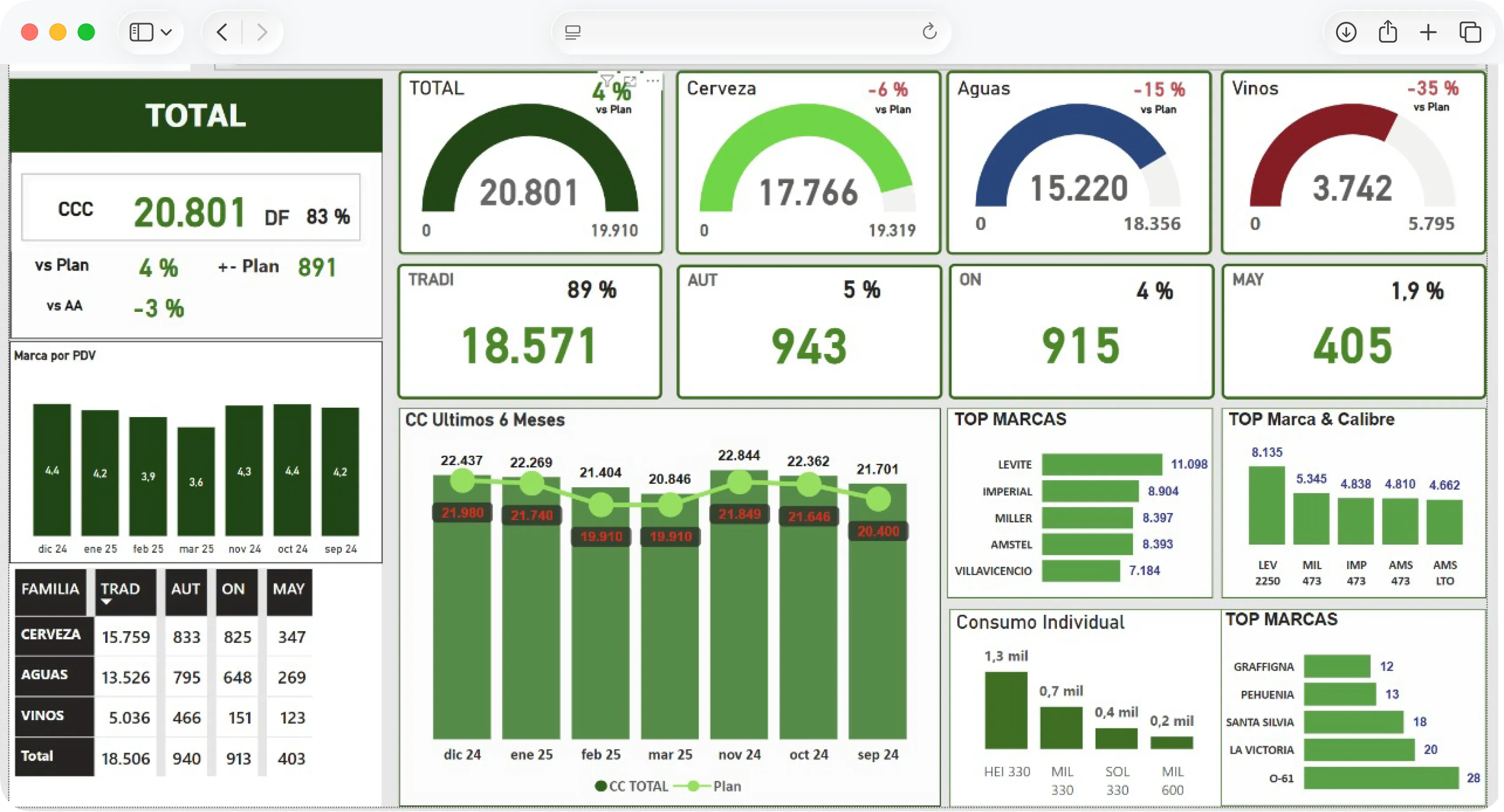
The sales team worked with spreadsheets and a monthly Power BI report. Preparing it took much of the month. By the time it was available, the period it described was already over.
The project began as an improvement to those reports. As it developed, the scope expanded into a platform for managing client, product and logistics information. My responsibility covered both the experience design and the development of the solution.
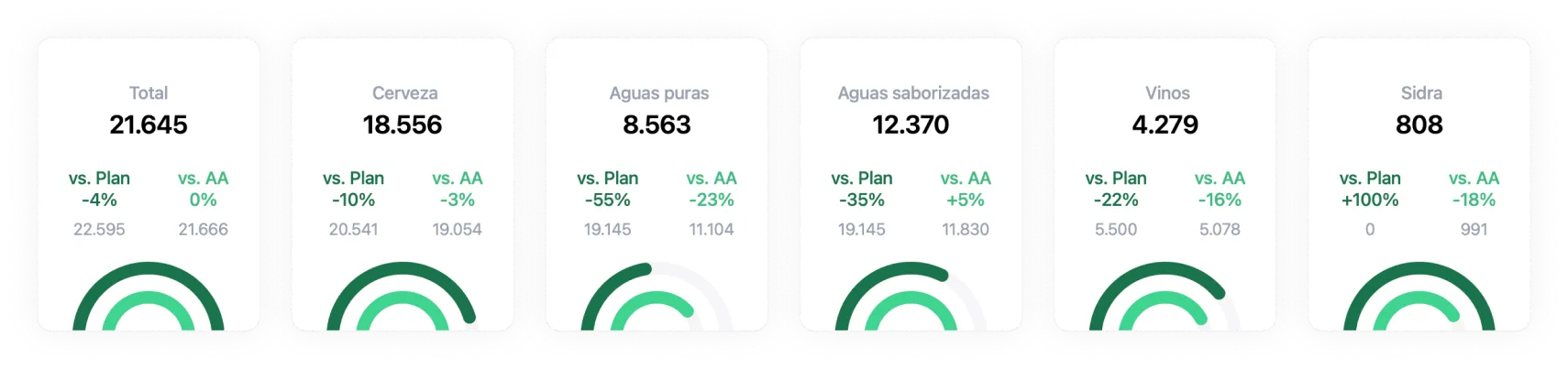
The platform needed to bring together more than 1,800 products and a database of 200,000 clients. Although the teams using it operated in four provinces, filters needed to work across the full dataset. Product, client and geography were three ways to explore the same information.
I organized the interface around overall indicators and the data behind them. KPI cards provided an initial reading; charts made it possible to compare trends and understand differences.
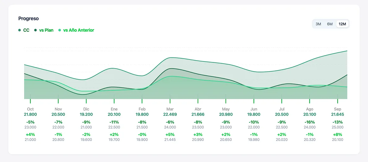
The progress chart brought together the current month, the previous year and variance against target indicators. The visual hierarchy needed to keep that comparison readable while maintaining a clear view of sales progress.
The first version provided access to information previously tied to a monthly report. As it became part of daily work, a new priority emerged: reducing the wait when querying and combining data.
To reduce processing during queries, I built a pipeline that extracts sales from their database and keeps clients and products in two separate catalogs, updated every day with new and modified entries. Each sale only references its client and product instead of repeating their data, and takes their properties from those catalogs. It also precomputes totals, rankings, channel and product-family breakdowns, and comparisons with the previous year.
The dashboard receives those results in files prepared for querying. Its main indicators no longer need to be rebuilt from every sales record each time the data loads.
Filters connected product, client and geography. I needed that relationship to support exploring alternatives without forcing someone to clear their previous selection.
For example, after choosing Misiones, the province selector still needed to show other provinces compatible with the remaining criteria. I implemented option calculations that apply every active filter except the one belonging to the field being evaluated.
This allowed someone to switch from Misiones to Corrientes while keeping their product, channel and other selections.
The map combined location, sales and segmentation to help teams decide where to visit and identify opportunities.
A single area could contain more than 30,000 active clients. To represent that scale, I grouped locations into cells of approximately one kilometer and calculated their sales volume. That aggregation reduced the number of elements the map needed to draw and made it possible to read sales distribution by area.
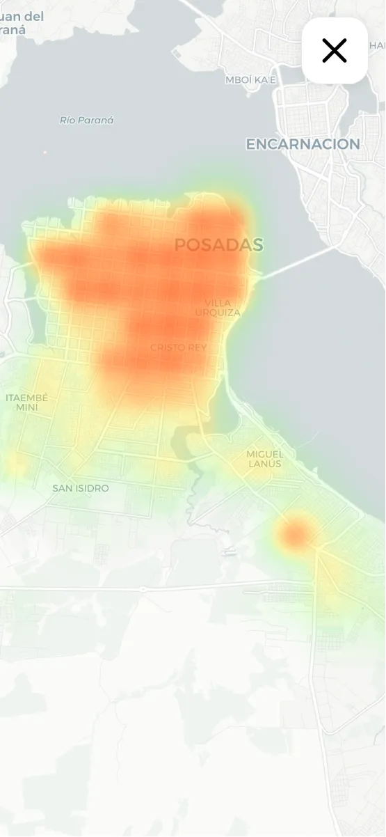
I designed the mobile experience with the same functionality as desktop, so teams could consult the information before and during their routes.
The platform became part of the daily work of more than 12 teams across four provinces. Information no longer depended on the monthly reporting cycle and began updating daily. The mobile experience extended access into fieldwork.
The first version validated everyday access to the information. Its adoption revealed which queries and combinations needed a faster response, and those observations guided the next stage of development.
I learned to prioritize improvements around actual use: first make the data available, then focus optimization on the tasks the team performed most frequently.