Loading...
Personal projects
Loading...

Page, menu and reservations for bars and restaurants
I designed and built Destto to bring a venue’s page, its mobile menu and its reservations together in a single link. I worked on the guest experience, restaurant onboarding, the management dashboard and the product’s identity.
The idea of a platform for restaurants first came up in one of my early exercises while studying UX. Later I tried to turn it into a product, but it was put on hold when I started my first professional role at Mudafy. It came back during the early stage of Agenddo, the project that later became Binbi, though it did not move forward then either.
I picked it up again while building Places, the places section of Findlist. Working again on how we discover and choose a place led me to revisit a problem I had been noticing since that first idea: how bars and restaurants present their information and connect the different tools they use.
At many venues I found the same path: the Instagram link led to a Linktree, and from there a map opened to see the location, a PDF to check the menu and another link to book through WhatsApp or an external platform. Each step took the person out of one context and into another, while they were still deciding whether they wanted to go.
I saw a fragmented experience and potential missed opportunities for the venue: someone interested could drop off before checking the menu or completing a booking. That was the hypothesis I wanted to explore with Destto.
Findlist’s places section offered a starting point. I decided to reuse part of that work and adapt it into a page the restaurant could share from its bio. The shift meant revisiting the language and interaction patterns: Findlist is an installable app people come back to; Destto had to make sense from the first visit in the browser, without downloading anything or learning a new navigation.
I scoped the MVP to presenting the venue, checking the menu and contacting or booking, with a setup the restaurant could complete without starting from scratch.
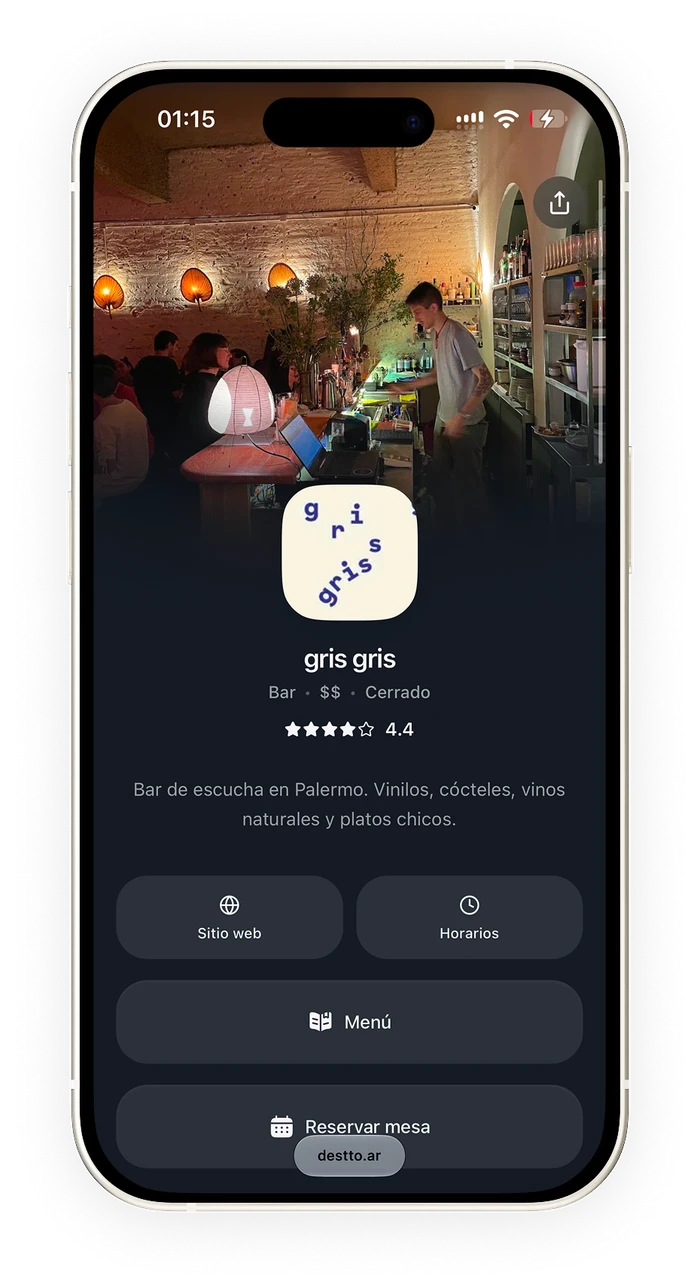
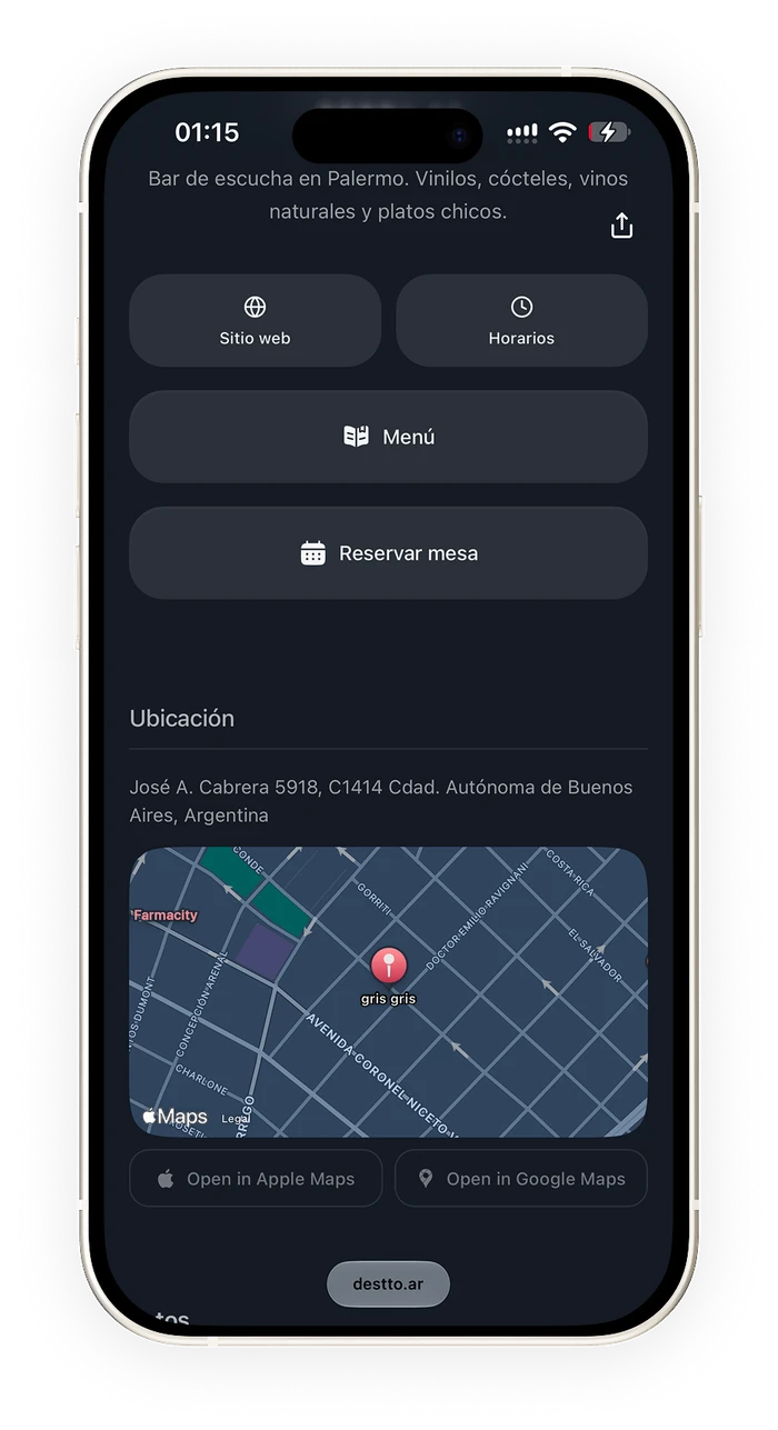
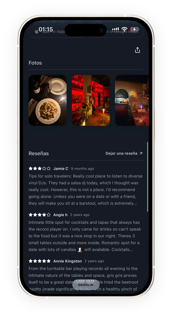
I organized the page around the questions of someone about to go out: what kind of place it is, what it offers, where it is and how to book or get in touch. Identity, photos and the main actions come first; location and reviews complete the picture.
I aimed for an interface with a premium presence, paying attention to typography, spacing and letting images lead. I wanted Destto to have personality while leaving room for each restaurant to express itself through its photos, identity and colors. That personalization had to coexist with easy-to-find actions and a menu that is comfortable to browse.
To keep things legible, I added an adjustment of the text color based on the background the venue chooses. That way, changing the look also takes into account the contrast of the information people need to read.
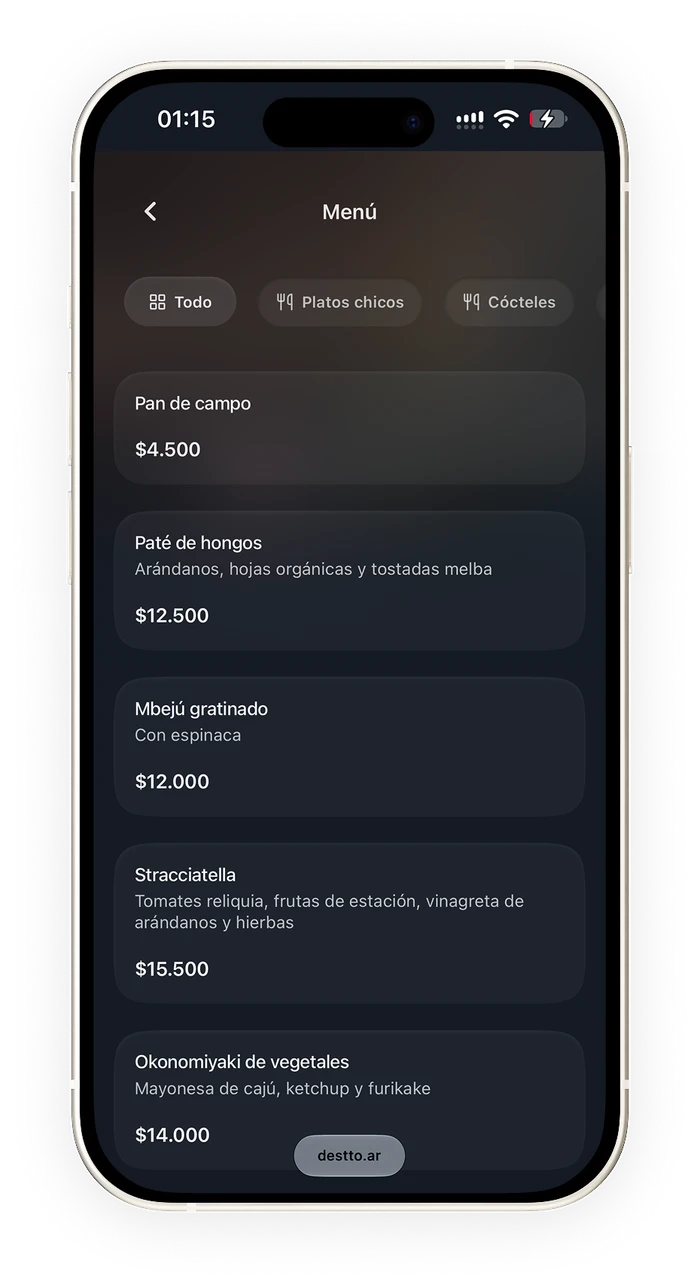
I designed the menu to be browsed on a phone, with accessible categories and a name, description and price for each dish. Photos are optional: the system also had to work for a bar that only had its written menu.
I planned for integration with the services venues already use to take orders from the table via QR. In this MVP, the focus is on validating the product and how it is used before adding that feature.
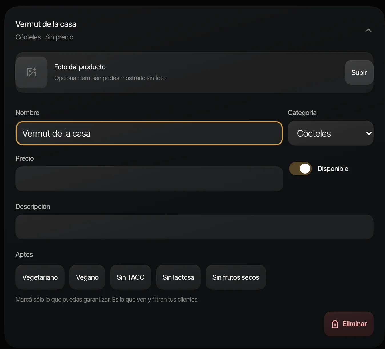
During implementation I revisited a decision. At first I explored inferring dietary labels from the dish name, but there was not enough ingredient information to do it reliably. I replaced that inference with labels declared by the restaurant. The interface explains that they are used to filter the menu and that only conditions the venue can confirm should be marked.
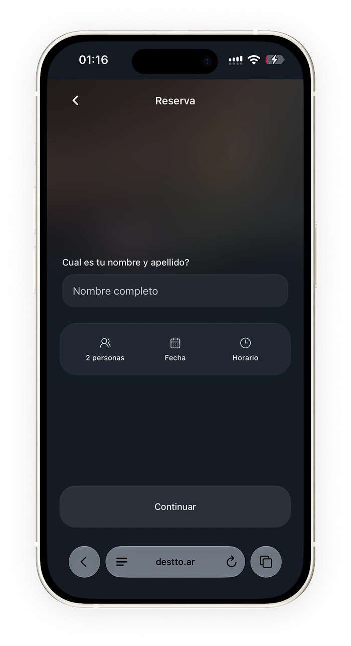
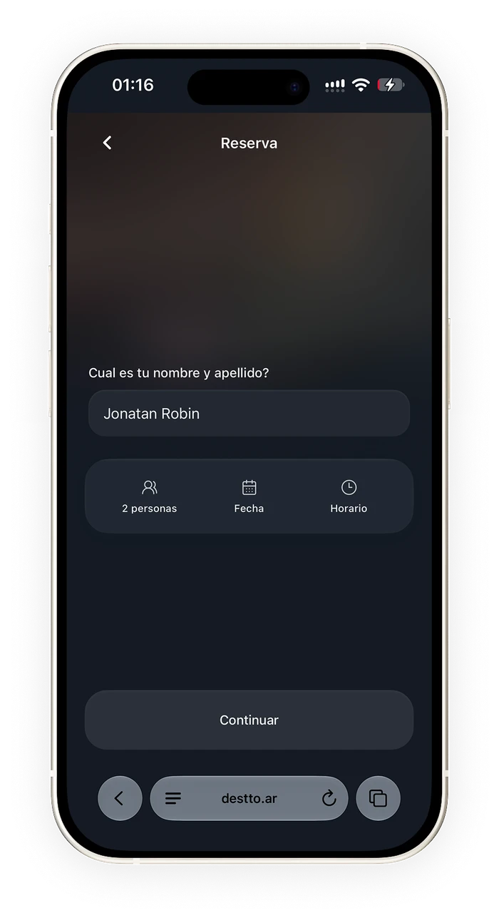
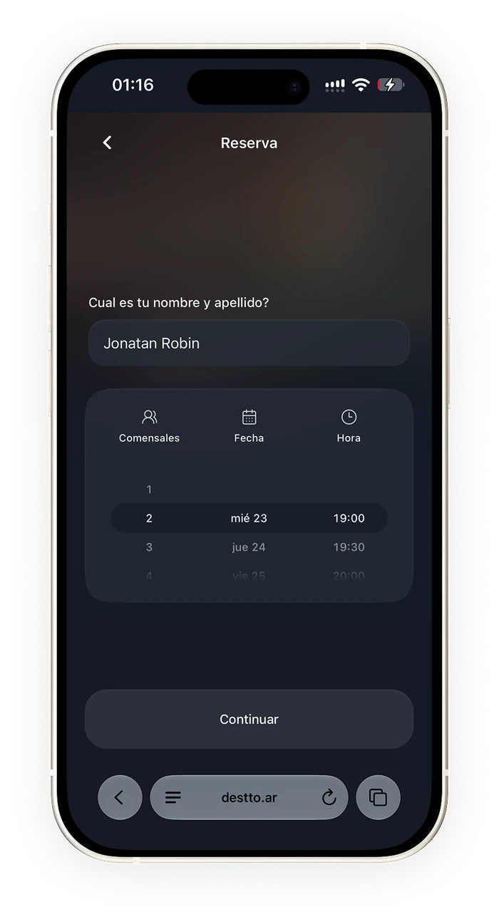
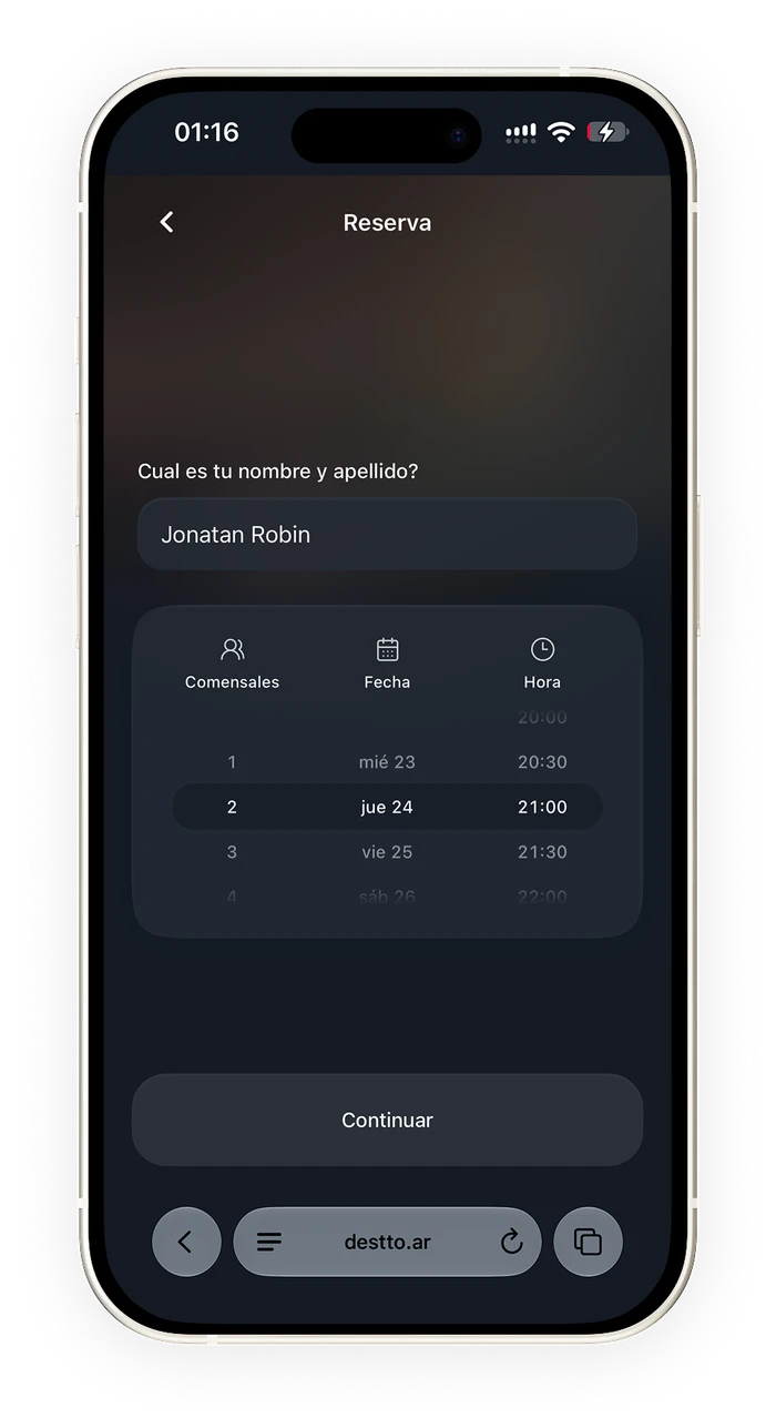
I analyzed local and international booking platforms and found flows that spread the choice of party size, date and time across several steps. I wanted to explore how to bring those decisions together without turning the screen into a form overloaded with information.
After several tests and experiments, I designed a component that brings the three choices together on a single screen, next to the person’s name. The control expands from a compact summary into a column-based picker, keeping the selected options visible. Party size, day and time can be adjusted without moving back and forth between screens; the booking is then reviewed before confirming it.
It was one of the project’s main interaction challenges: concentrating the decisions while keeping the reading simple on a phone. Availability follows the restaurant’s real shifts, including services that run past midnight. Reservations are enabled once the venue sets up its tables and hours.
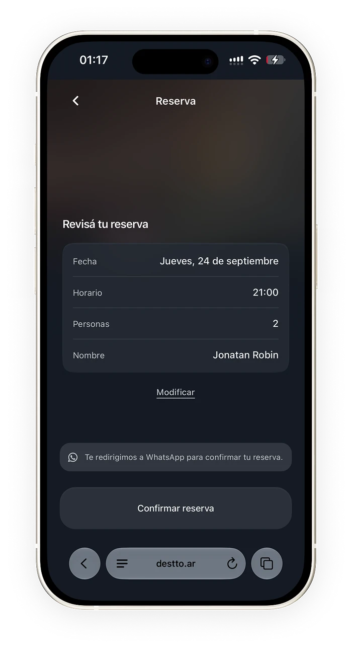
Previous version
The first version ended in WhatsApp after reviewing the details. I kept the review, but moved confirmation and changes into Destto so the booking kept a record within the product. The central WhatsApp channel and automated reminders are still in development.
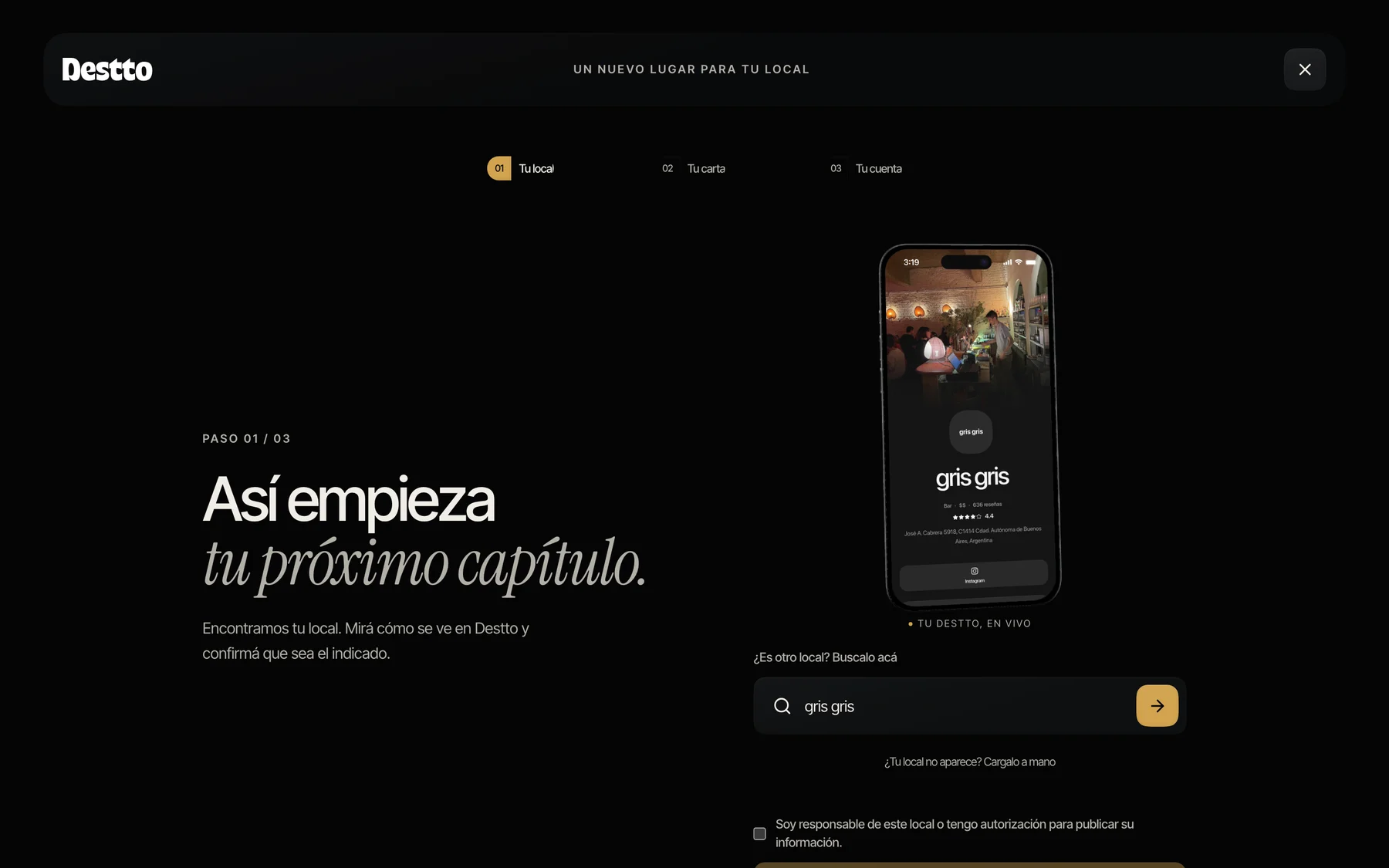
I wanted onboarding to feel almost like magic: type the venue’s name and find its page already built. I designed the flow so the owner would see their venue from the start and could review the result, instead of facing an empty setup.
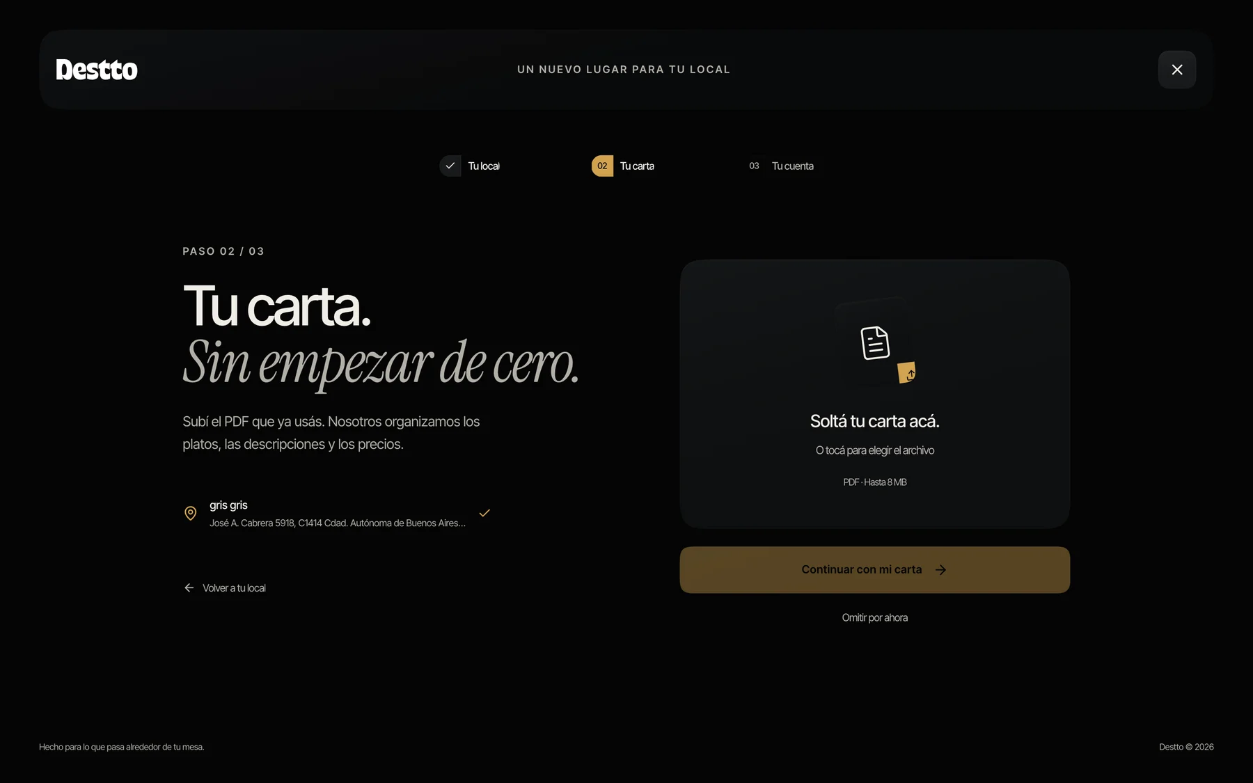
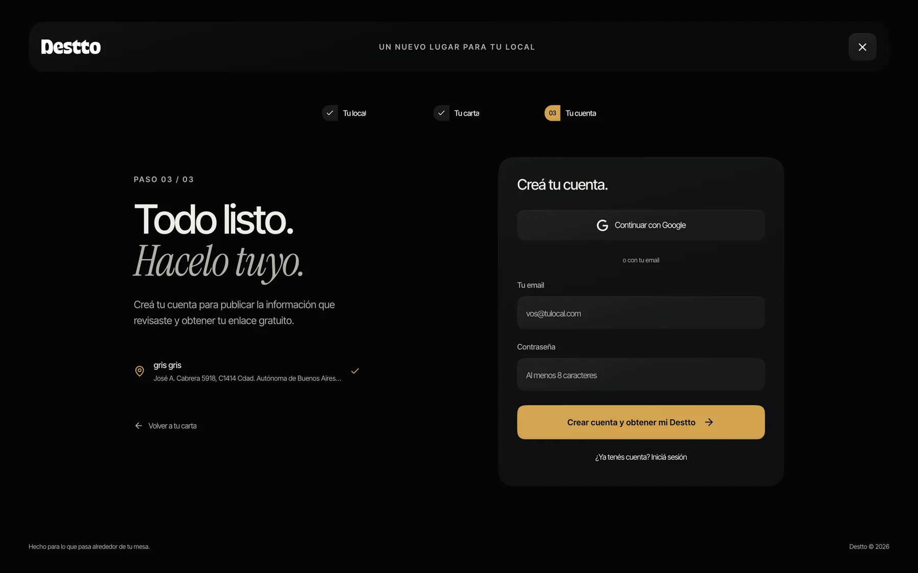
The same intent carries on with the menu: upload the PDF the venue already uses and find the menu ready to review. The account comes after seeing the result, to save the work and get a link of their own. If the owner does not have the menu at hand yet, they can complete that step later.
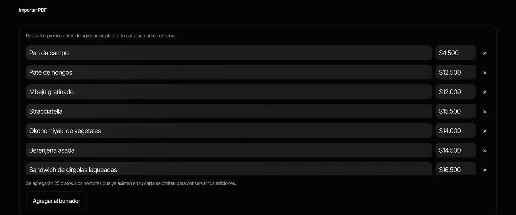
After uploading the PDF, the owner finds the dishes and prices organized for review. They can correct names, prices and categories before publishing, without entering the whole menu by hand. That step keeps control over what guests will ultimately see.
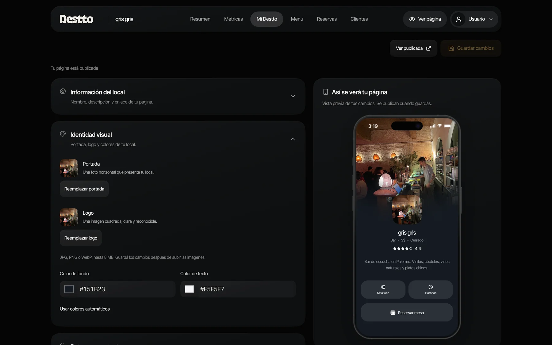
In the editor, changes appear next to a mobile preview to evaluate photos, colors and contact details in context. Public actions appear only when the information needed to use them exists, avoiding dead-end buttons during setup.
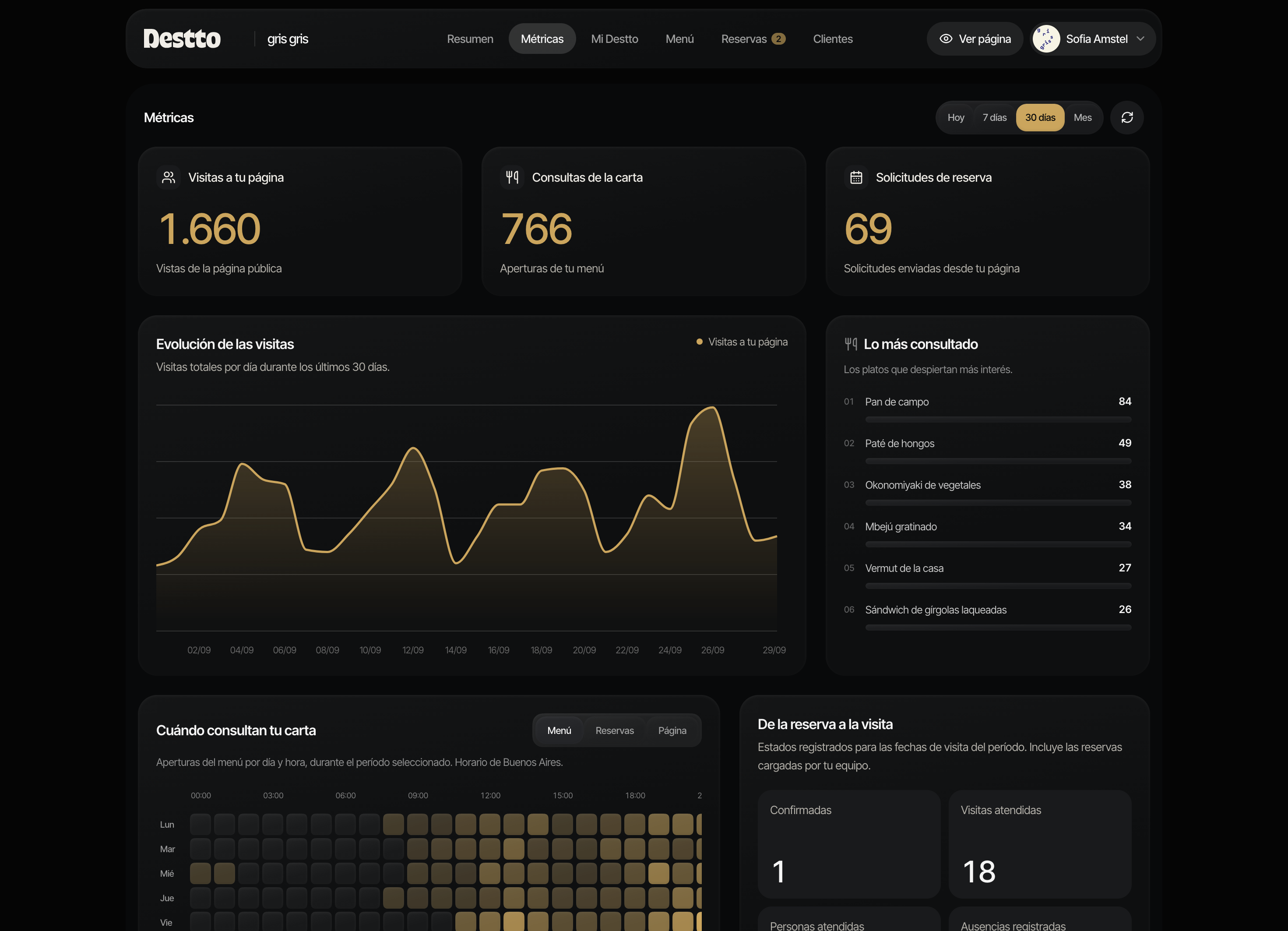
The dashboard brings together tasks such as sharing the link, completing the setup and following the day’s reservations. Metrics distinguish visits, menu opens, dishes viewed and booking requests.
This data shows which parts of the page generate interest. Its scope is kept separate from sales and actual visits: a view or a request does not, on its own, confirm an occupied table.
Destto is live and we are landing our first clients. The venue page, the menu and reservation management are already available. We also got our first search engine ranking results within two days.
Launching it was especially rewarding: I got to close the loop on one of my first ideas from when I was studying UX, which had been on hold through different stages of my career. I really enjoyed designing and building it. I also got to work again with my sister, Estefanía Robin, with whom I love sharing projects and from whom I learn a lot.
Since that first idea, every visit to a bar or restaurant was a chance to talk and better understand how it worked from the inside. Those conversations stayed with the project for years, even before I was building it. They helped me keep the venue’s work in mind, beyond the experience of the people who visit it.
With the first clients, the next step is to validate how Destto fits into that day-to-day operation and decide which features to add based on how it is used.
Explore Destto