Loading...
Personal projects
Loading...
An app for saving and organizing content
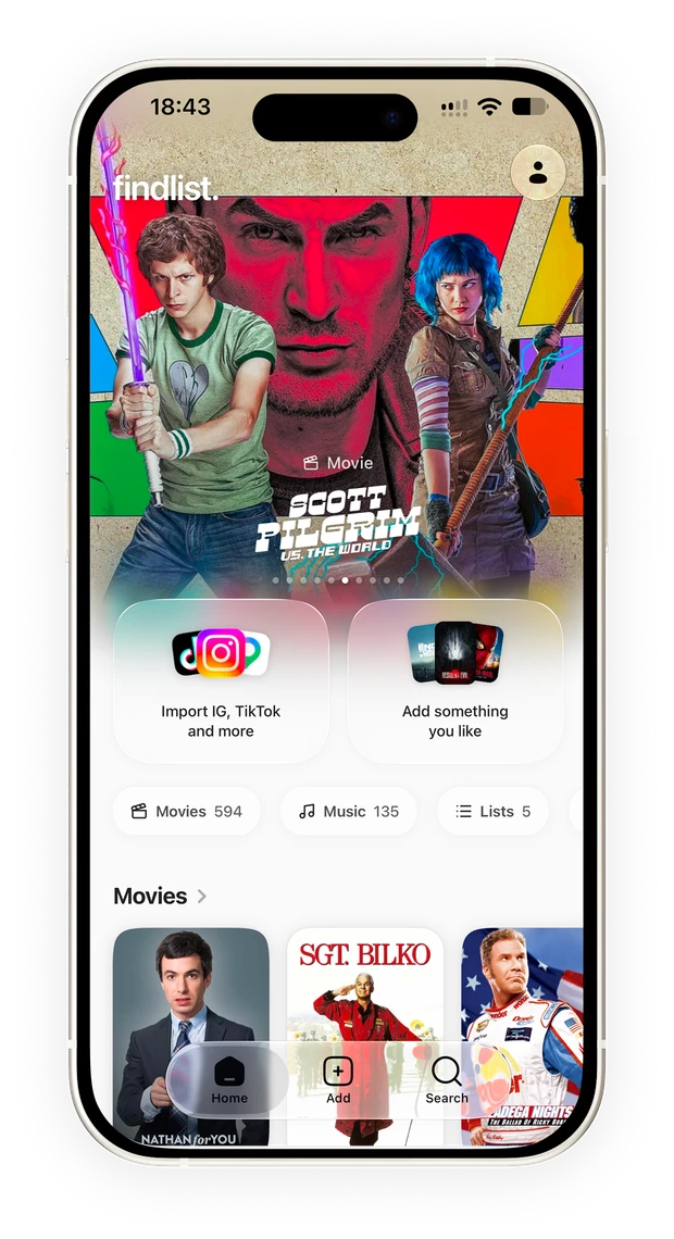
I designed, built and released Findlist for iPhone. The app turns posts, links, screenshots and photos into a library of movies, music, places, events, books and more, with the information and actions to come back to them later.
Findlist grew out of Keepfeed, my first attempt to gather scattered links and screenshots. An organized collection solved part of the problem: when I came back, I still had to open each source to remember what had caught my interest.
I decided to change what gets saved. A post about a movie becomes the movie, with the original source available as context. A carousel with several recommendations can become separate items, so each one can be found later. That change shaped the rest of the product: how to organize the collection, what information to show and what each detail screen should let people do.
I used the opening animation to explain how it works before asking for an account. Familiar sources turn into movies, songs, places and books. The motion shows the transformation Findlist offers and leaves a single action to continue.
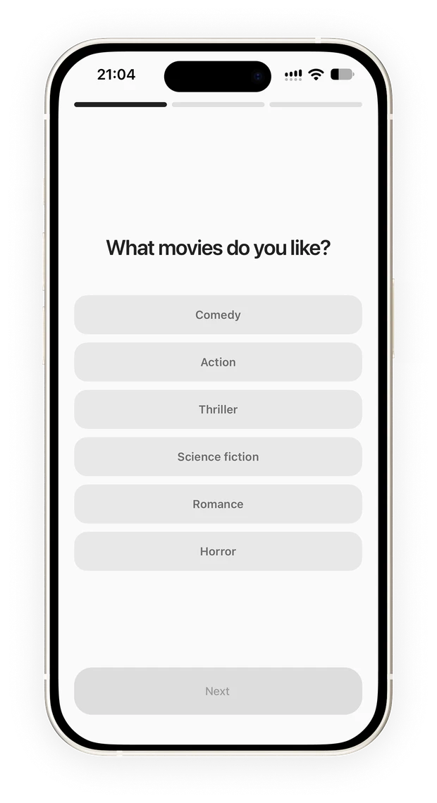
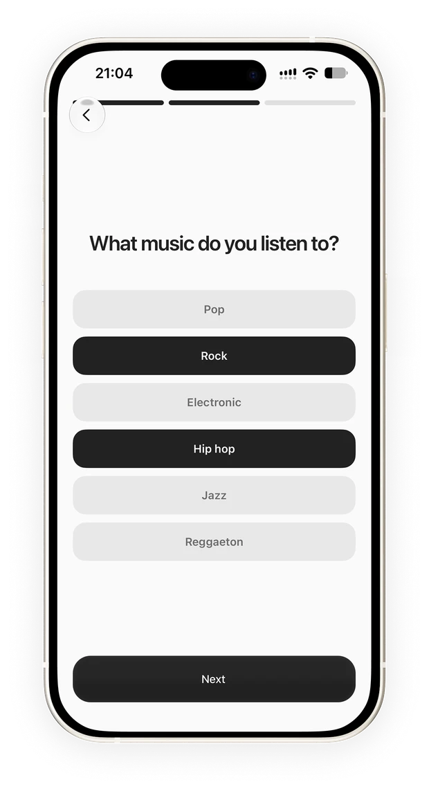
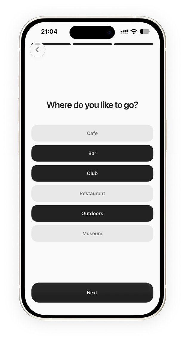
Then three short screens let people choose up to three preferences per topic. Those answers give recommendations a starting point, so the first visit has something to explore even when the collection is empty.
From the iOS share menu, people can send a link, a post or an image to Findlist and go back to what they were doing. I separated confirming the save from the time needed to recognize the content.
I built a native extension that collects the content and sends it to a service that continues processing in the background. Recognition can move forward without opening Findlist; when people come back, the app retrieves the processed information. That way, saving does not require waiting for the detail screen to be ready.
Recognition also meant deciding when to trust a result. The system combines the post’s text and the text it extracts from images with a model that proposes the content and a search across reference catalogs. Because titles can arrive translated or incomplete, it compares names before accepting a match. When there is not enough certainty, people can search and correct the result.
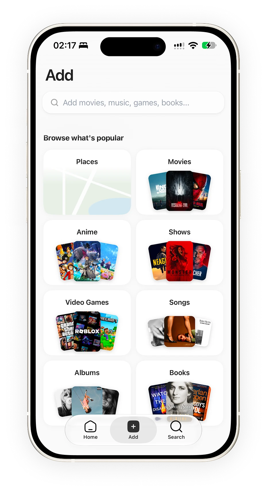
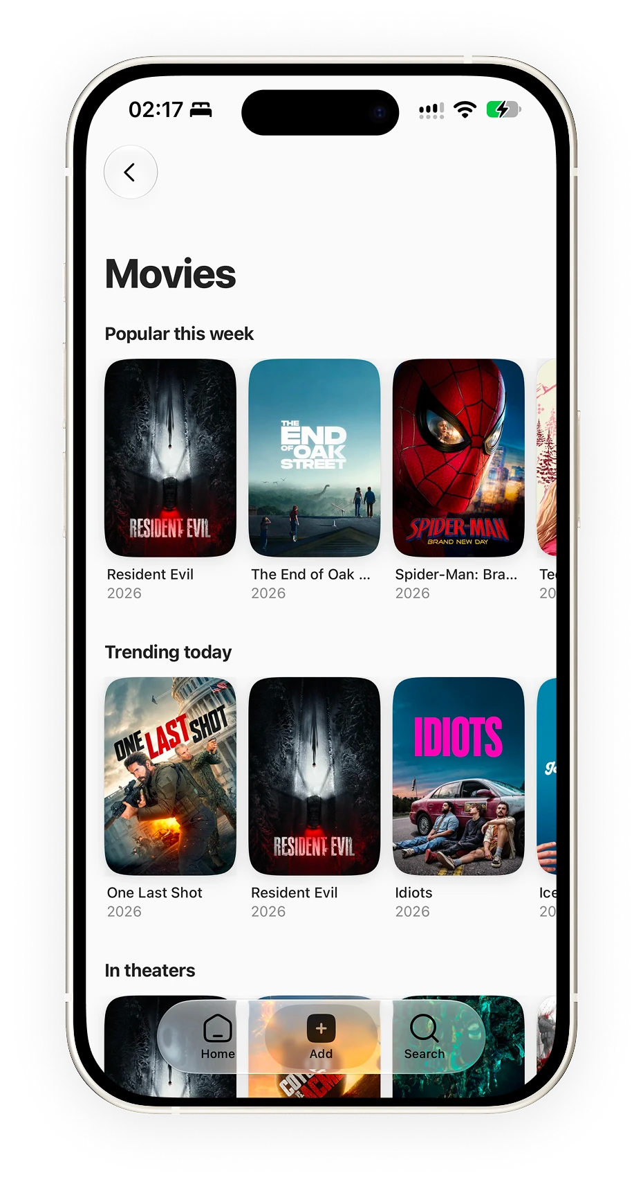
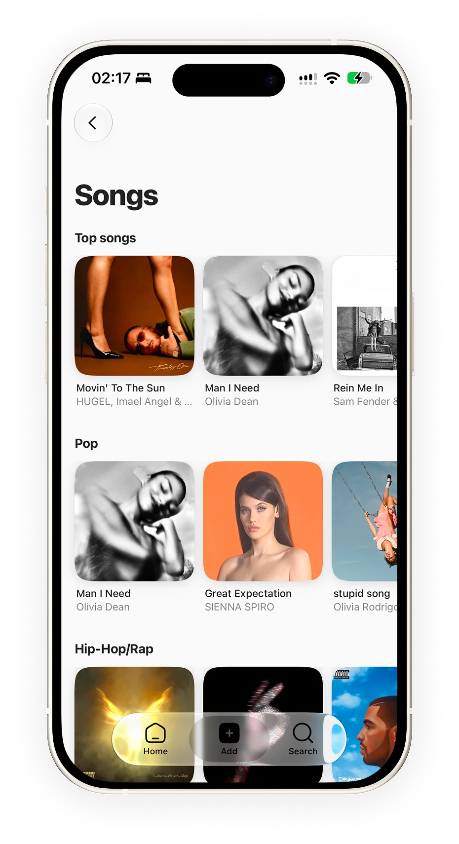
To add things directly, I combined search and categories. Someone who knows what they want can go straight to a title; someone who remembers the kind of content but not its name can start from visual shelves of movies or music. The screen offers a starting point without requiring a precise query.
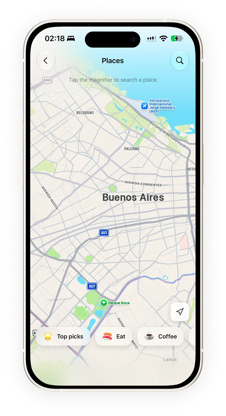
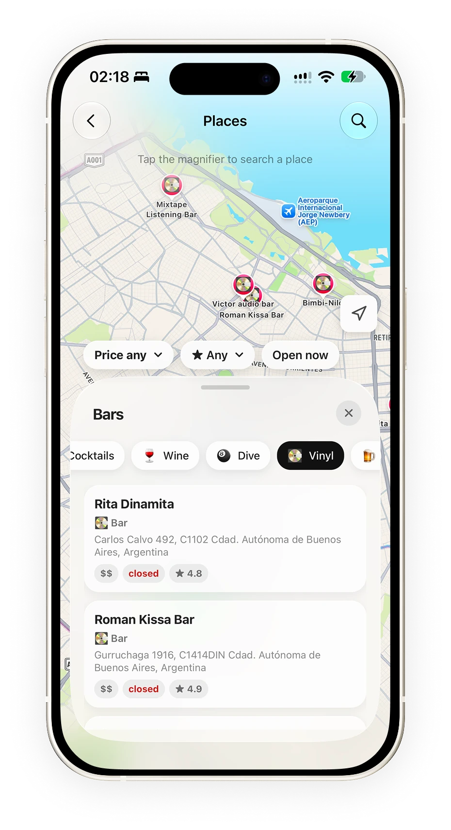
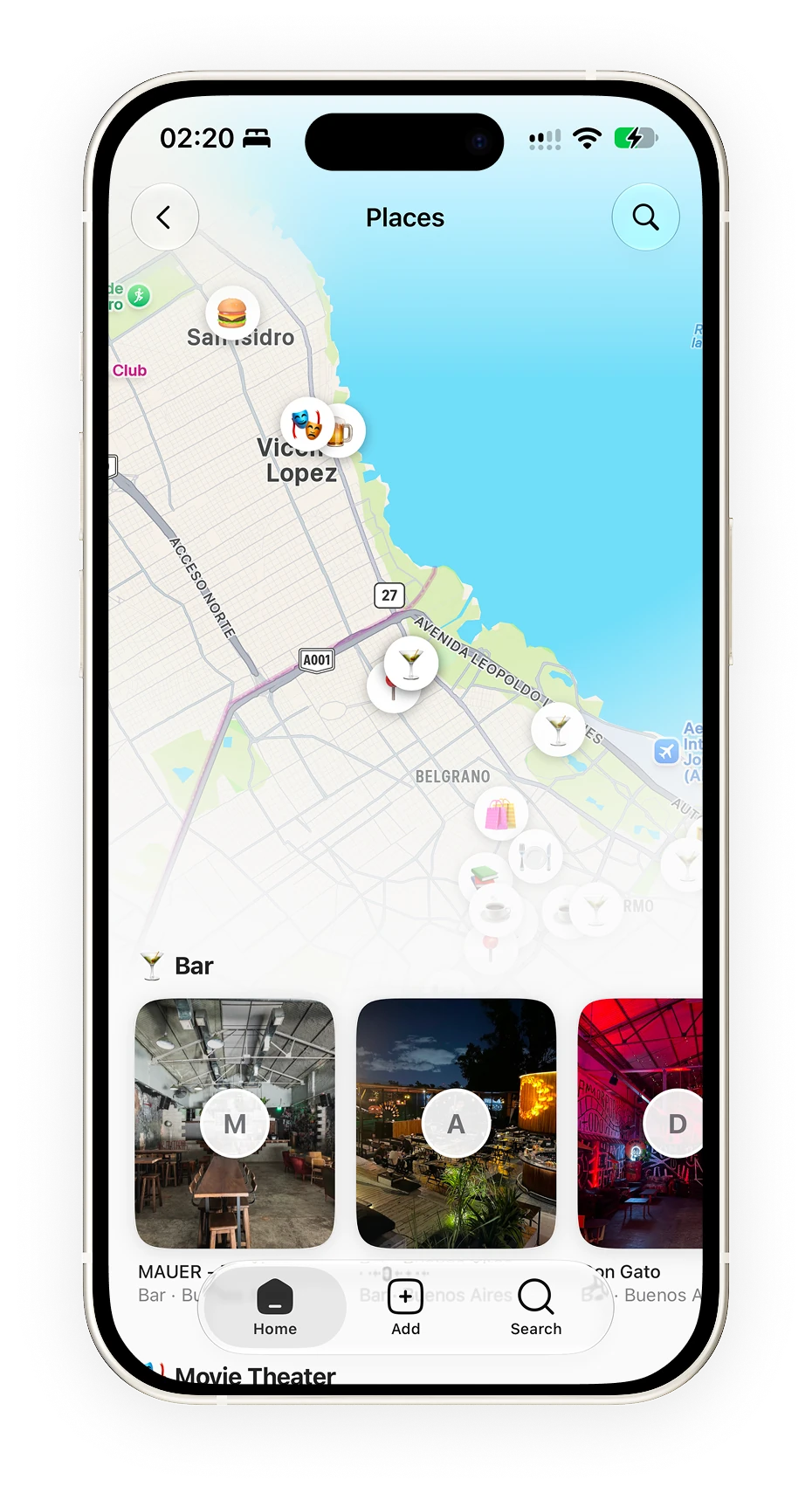
Places needed a different path. Search starts from an area on the map, and a panel lets people explore nearby results with price, rating and opening-hours filters while keeping the location visible.
When people return to their saved places, the map and the cards stay together. Location is part of how a place is discovered, recognized and chosen, so I kept it present throughout the flow.
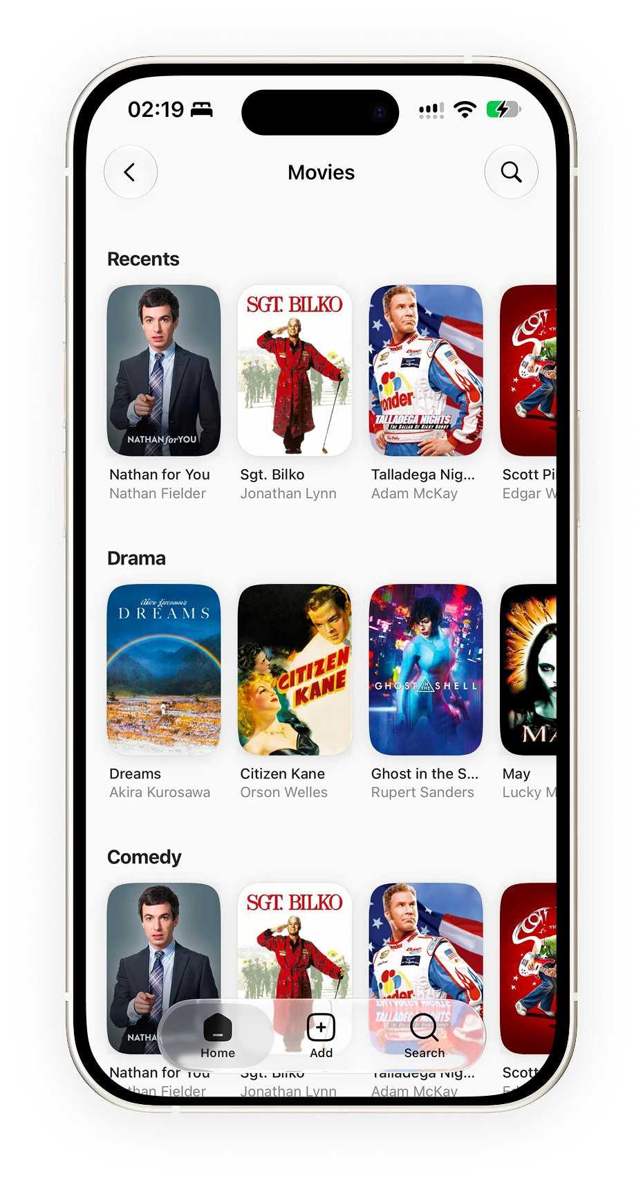
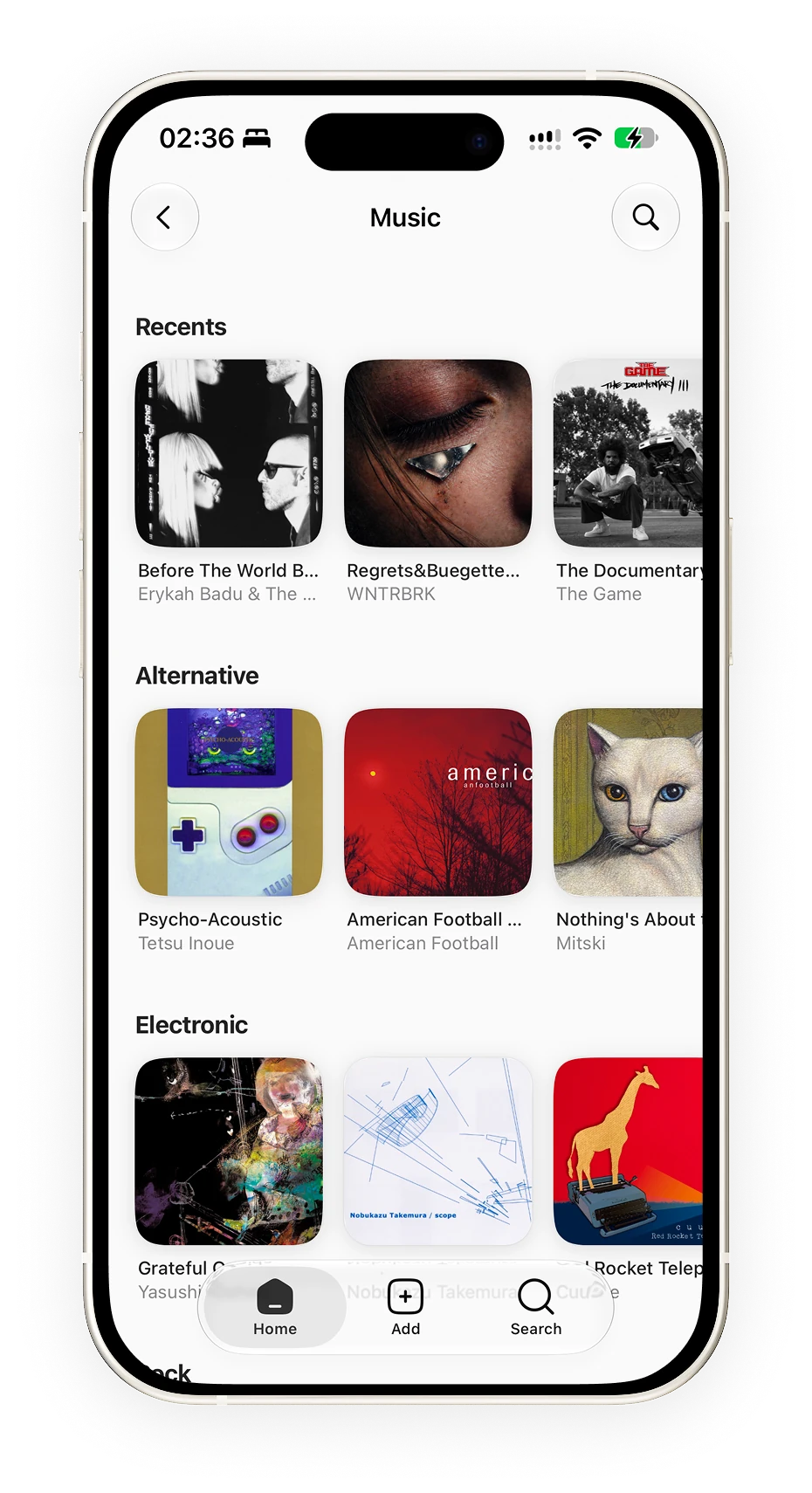
I organized the home by content type, with the latest saves first. In movies and music, genre shelves offer another way in when someone remembers the style but not the title. Posters and covers keep their formats to make visual recognition easier.
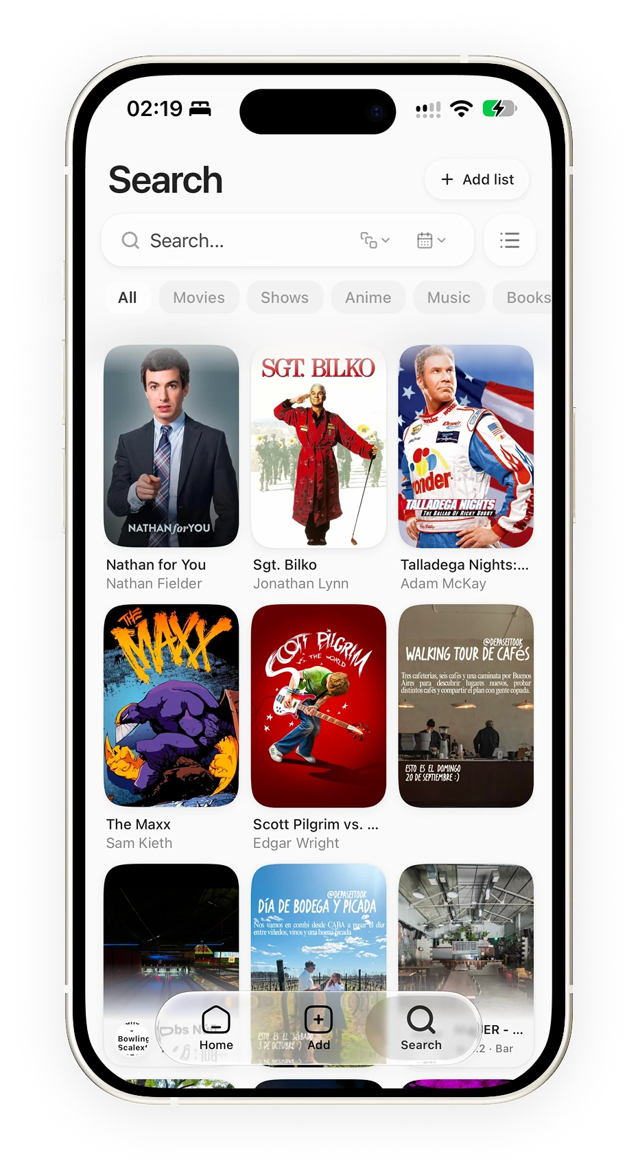
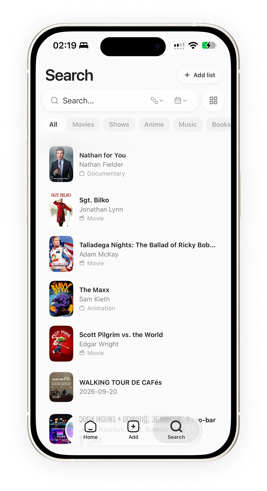
Search lets people browse the collection in two ways: a grid for recognizing an image and a list that gives more room to titles, creators and categories. Results can be filtered and the view changed without leaving the search. I designed both to support different ways of remembering the same content.
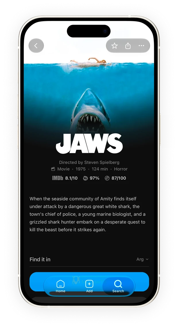
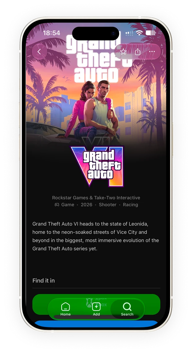
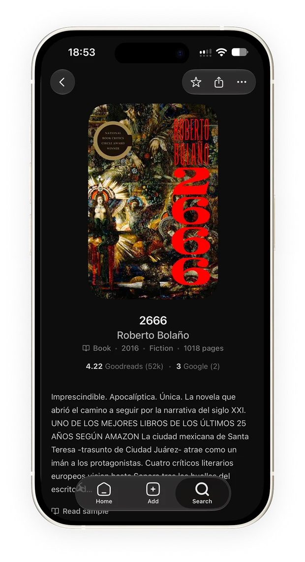
Detail screens share a structure, but each category prioritizes different questions. A movie brings together a synopsis, a trailer and where to watch it; a game, platforms and options to play or buy it; a book, its author and information on how to get it.
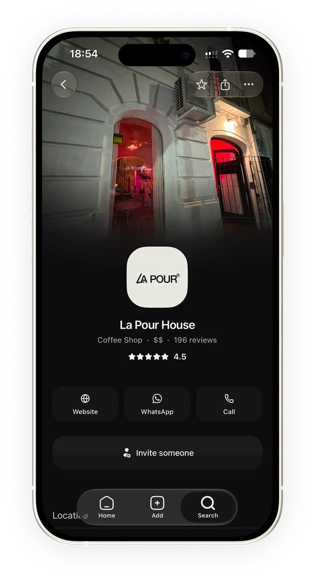
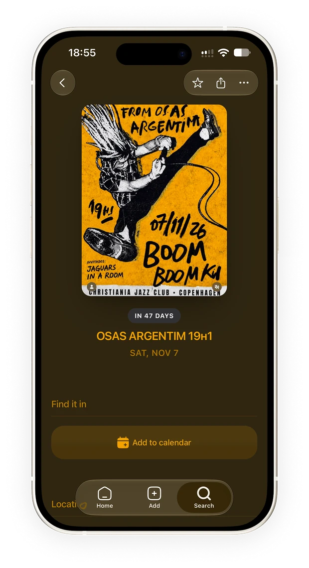
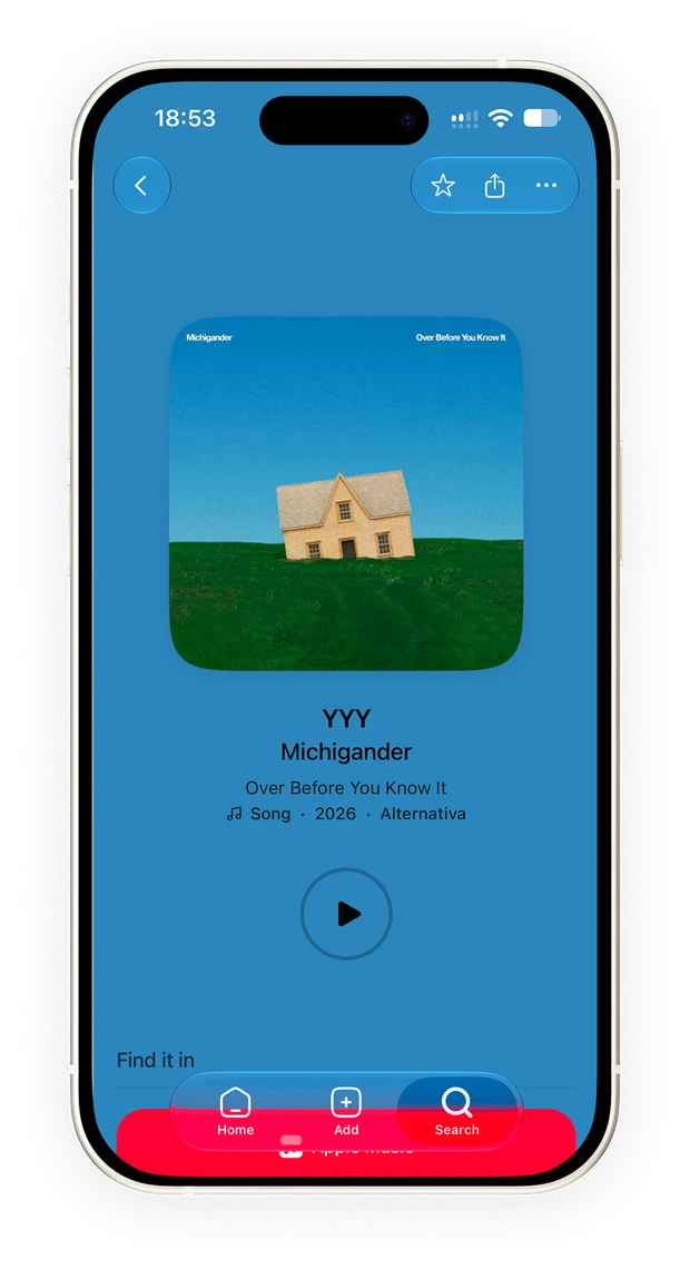
The actions change too: getting to a place, listening to a song or getting tickets. Color and imagery come from each item, while navigation and components keep continuity across detail screens.
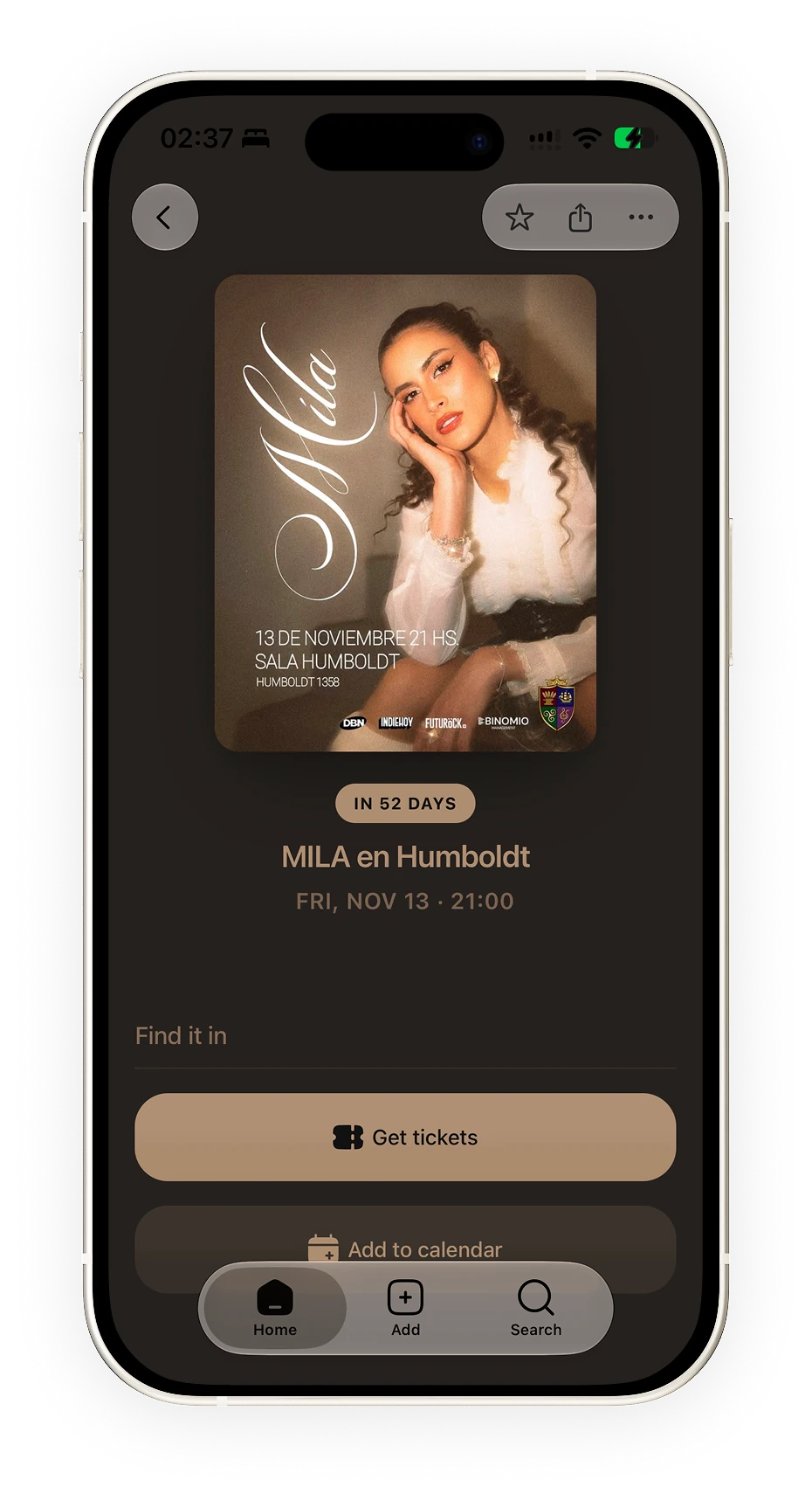
For events, time defines the hierarchy: the date and countdown stay visible, with access to tickets and the calendar. It is an example of how I adapted the same system to a specific decision: planning to attend.
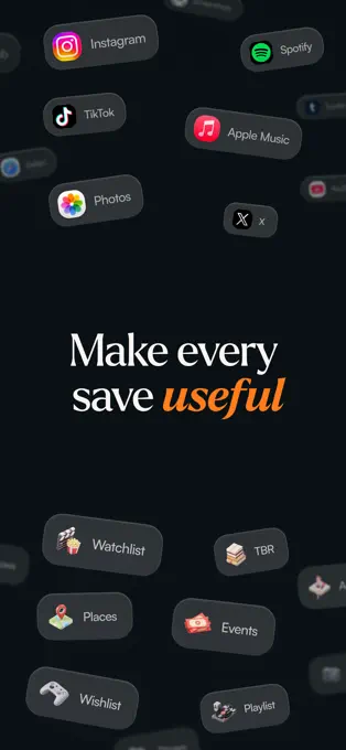
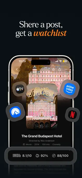
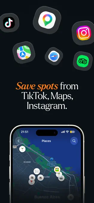
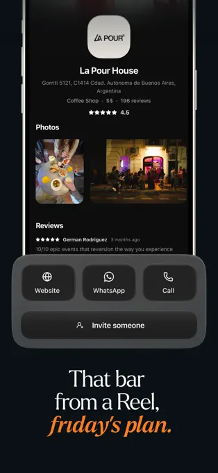
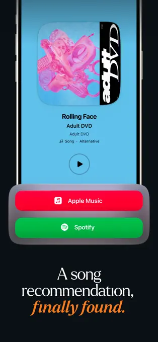
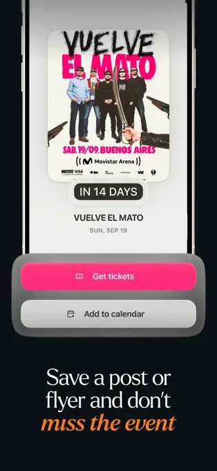
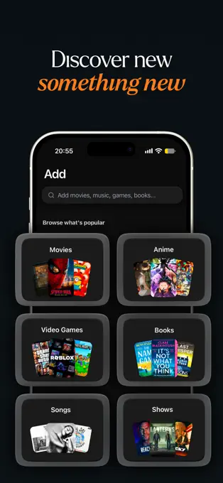
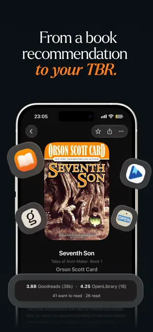
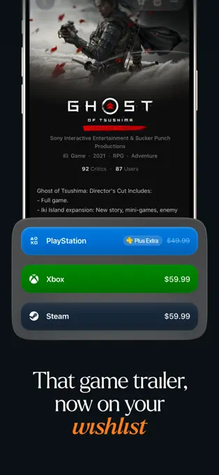
I designed the listing around recognizable situations: a movie to watch, a bar to go to, a song to listen to and an event not to miss. Each image combines an idea, a line and the screen that proves it. The sequence turns the promise of making every save useful into concrete examples from the product.
Findlist is available on the App Store. I took the project from product definition through design, development and its presentation in the store. I keep working on recognition and on the ways people rediscover what they saved.
When moving from Keepfeed to Findlist, I first tried to adapt the existing components. As categories with different information and actions appeared, that structure was no longer enough. I had to rebuild the design system around what each type of content needed to show and let people do.
Designing and building it let me work on those decisions together: adding a category meant defining how to recognize it, what data to keep and how to turn it into a useful detail screen. That was the central lesson of the project, and the principle I keep following as it grows.
Explore Findlist on the App Store