Loading...
Works
Loading...

Building management: finances, notices and claims
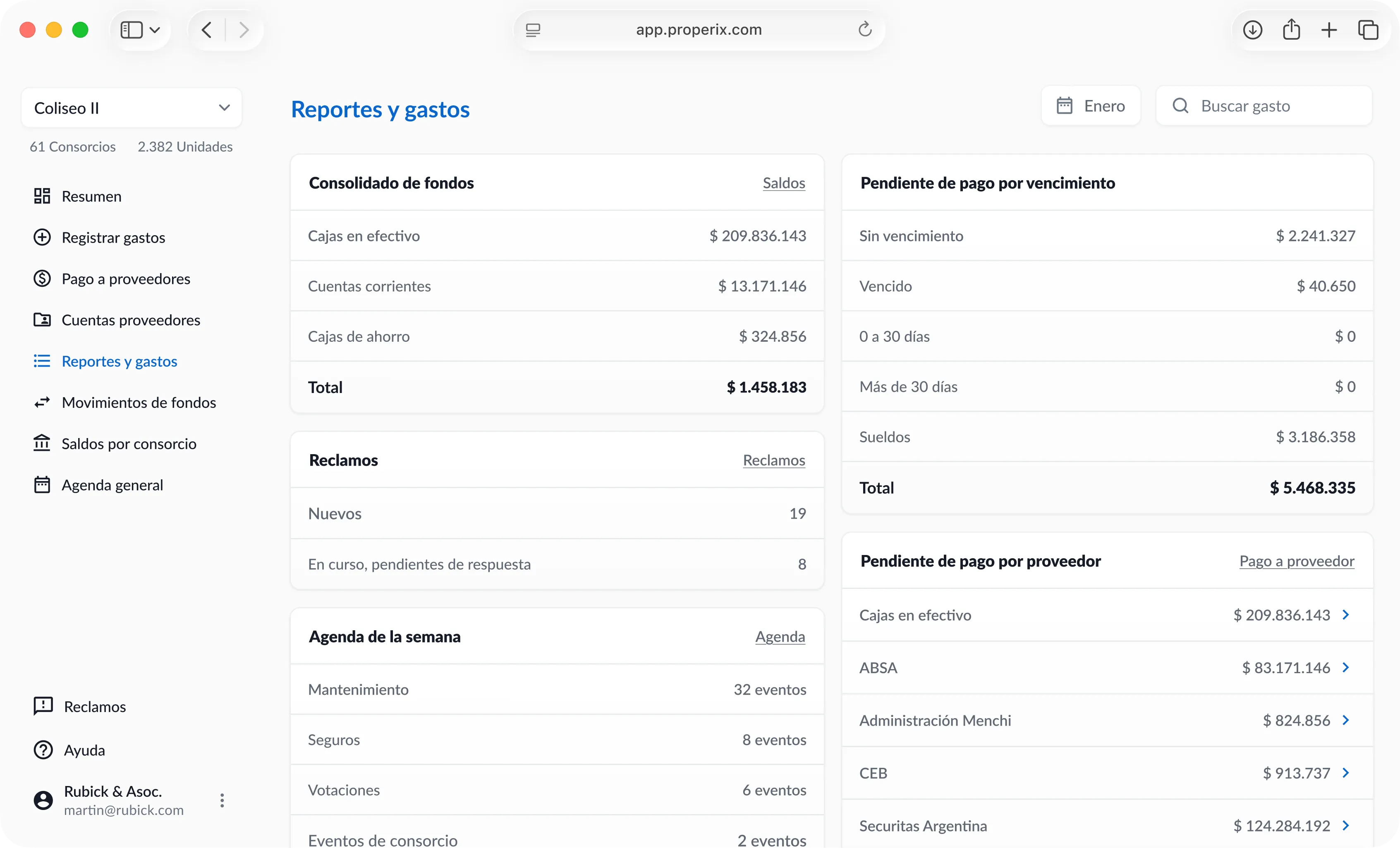
Properix is a property management platform used by over 100,000 residents and administrators across LATAM.
The project started as a redesign of an existing desktop tool, but it evolved into a complete overhaul of the user experience, including a new mobile app and a resident-facing communication platform.
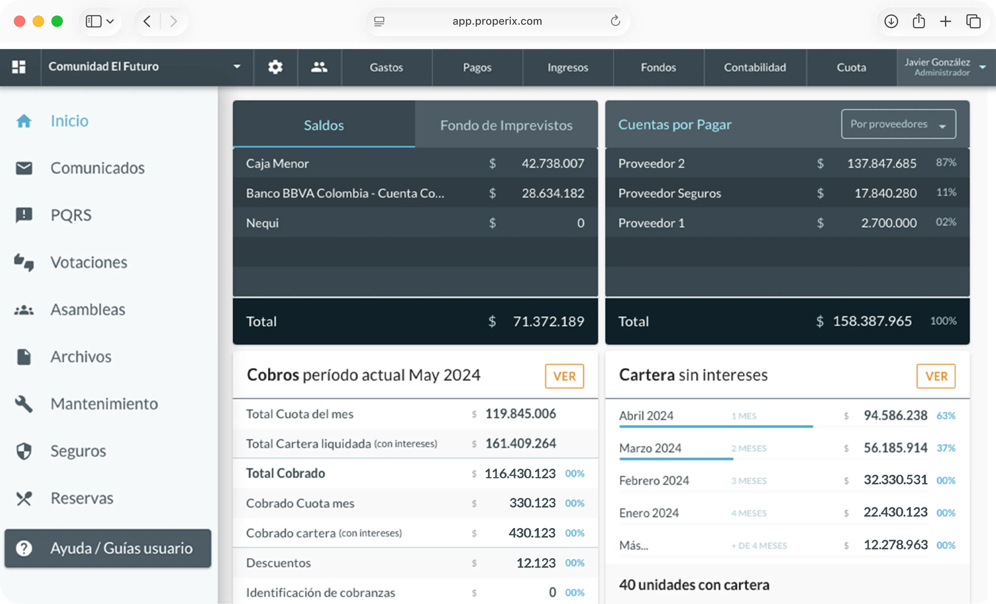
The starting point was an existing desktop tool. We worked with the development team to improve the experience while its technical migration moved forward. Throughout the project, interviews with administrators helped us understand what they needed to keep from that tool and which problems it left out.
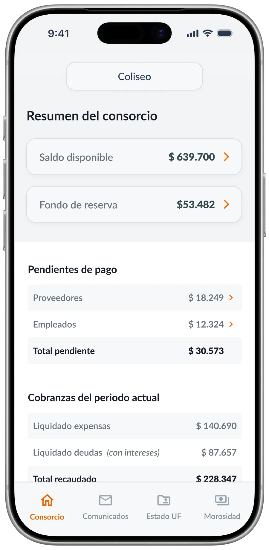
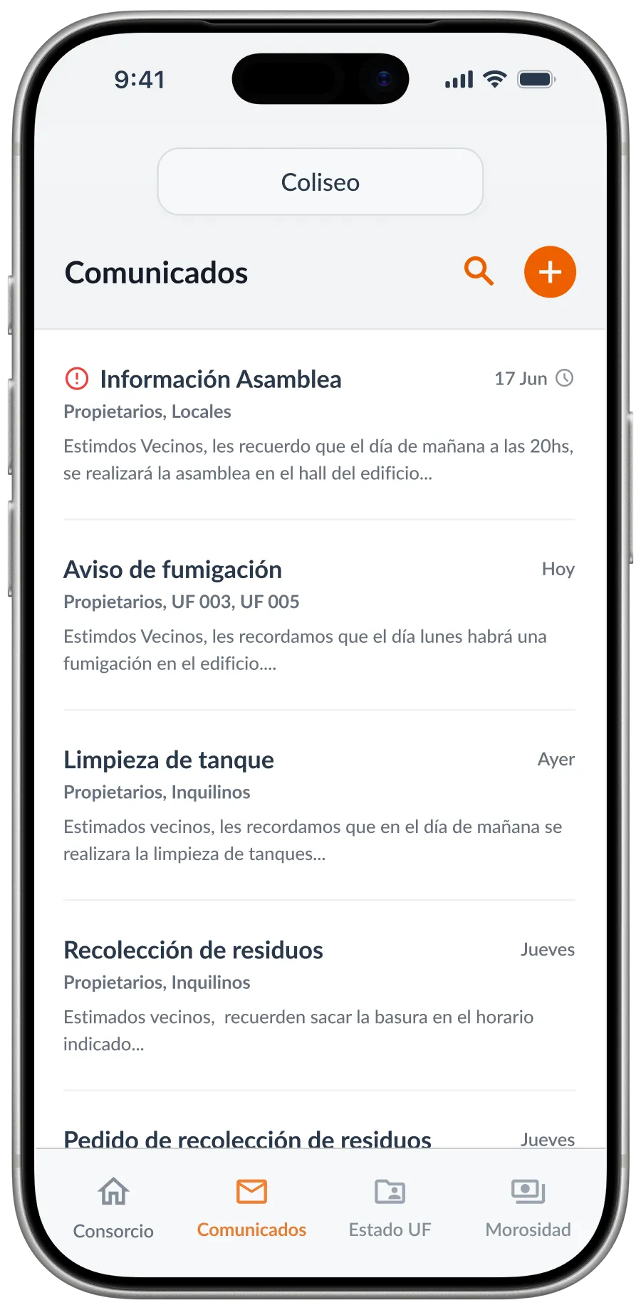
Administrators worked on the move with printed spreadsheets, WhatsApp messages they sent to themselves as notes and emails with residents and owners. A mobile version was the most requested feature, but moving the desktop screens to a phone did not solve how to organize those tasks.
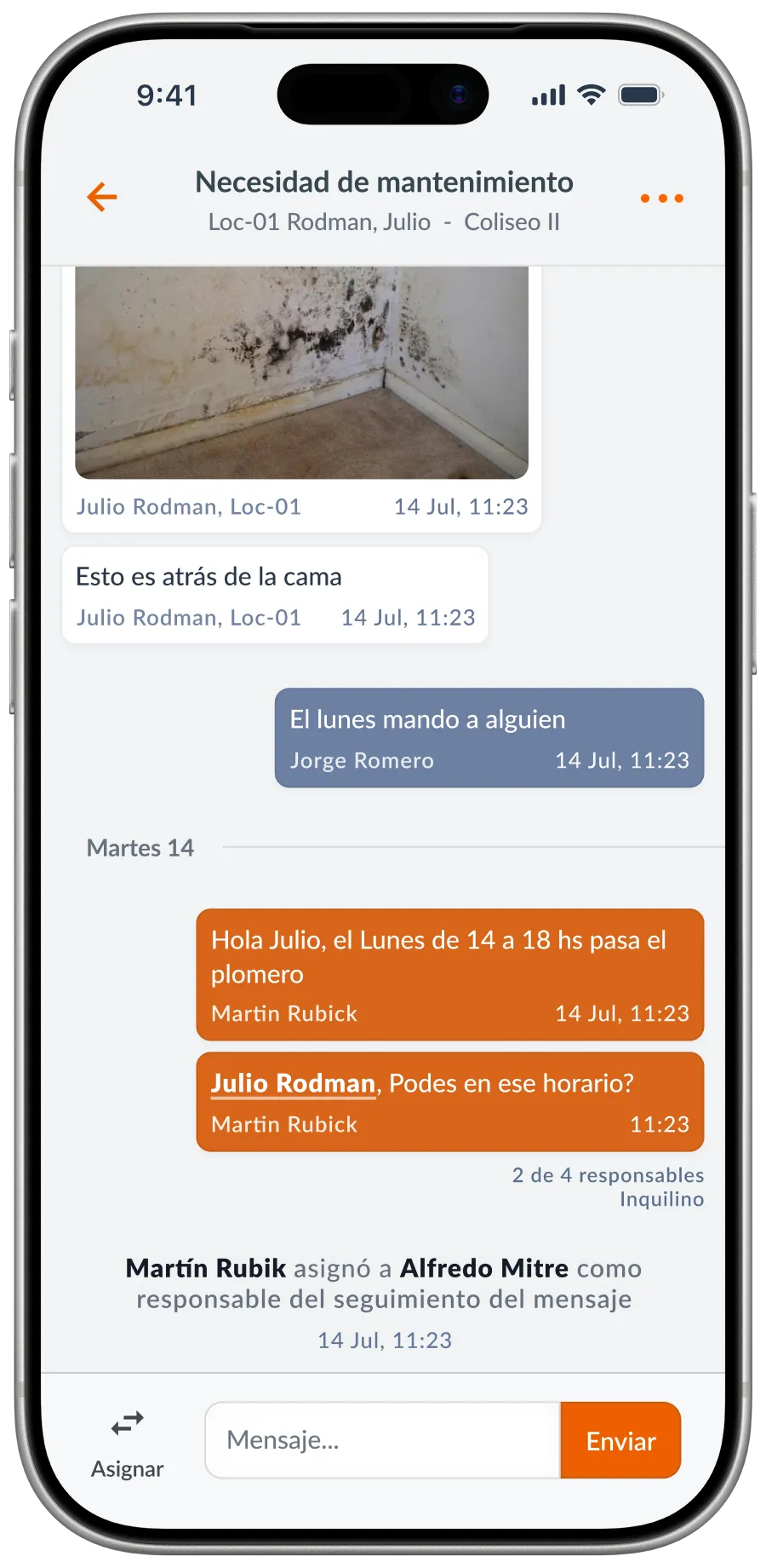
We built a dedicated app for that context, prioritizing claim tracking and urgent communication. Interviews with experienced administrators throughout the project helped us distinguish what they needed to handle from their phone and which tasks required full desktop work.
The dashboard answered another need in that same context: checking the state of the building at a glance. We prioritized financial information, such as available funds, pending payments and collections, with access to each block’s details without overloading the main view.
Mass notices were sent by email and could end up in reply chains that were hard to manage. The new system let administrators mark important messages, schedule deliveries and choose recipients by role or unit.
The connection with the chat gave that communication continuity: replies could start a structured conversation, be assigned to someone and be followed until resolved. The notice and its follow-up stayed within the same workflow.
Designing that chat meant accounting for conversations that could stay open for days and change hands. The history had to keep track of what had happened and who was in charge, so someone else could pick up the case. We also organized photos and files by the conversation they belonged to, making them easier to find later.
For residents, WhatsApp and email were the main link with the administration. Crossed messages and scattered information made it hard to know what was going on and to follow up on a question or a claim.
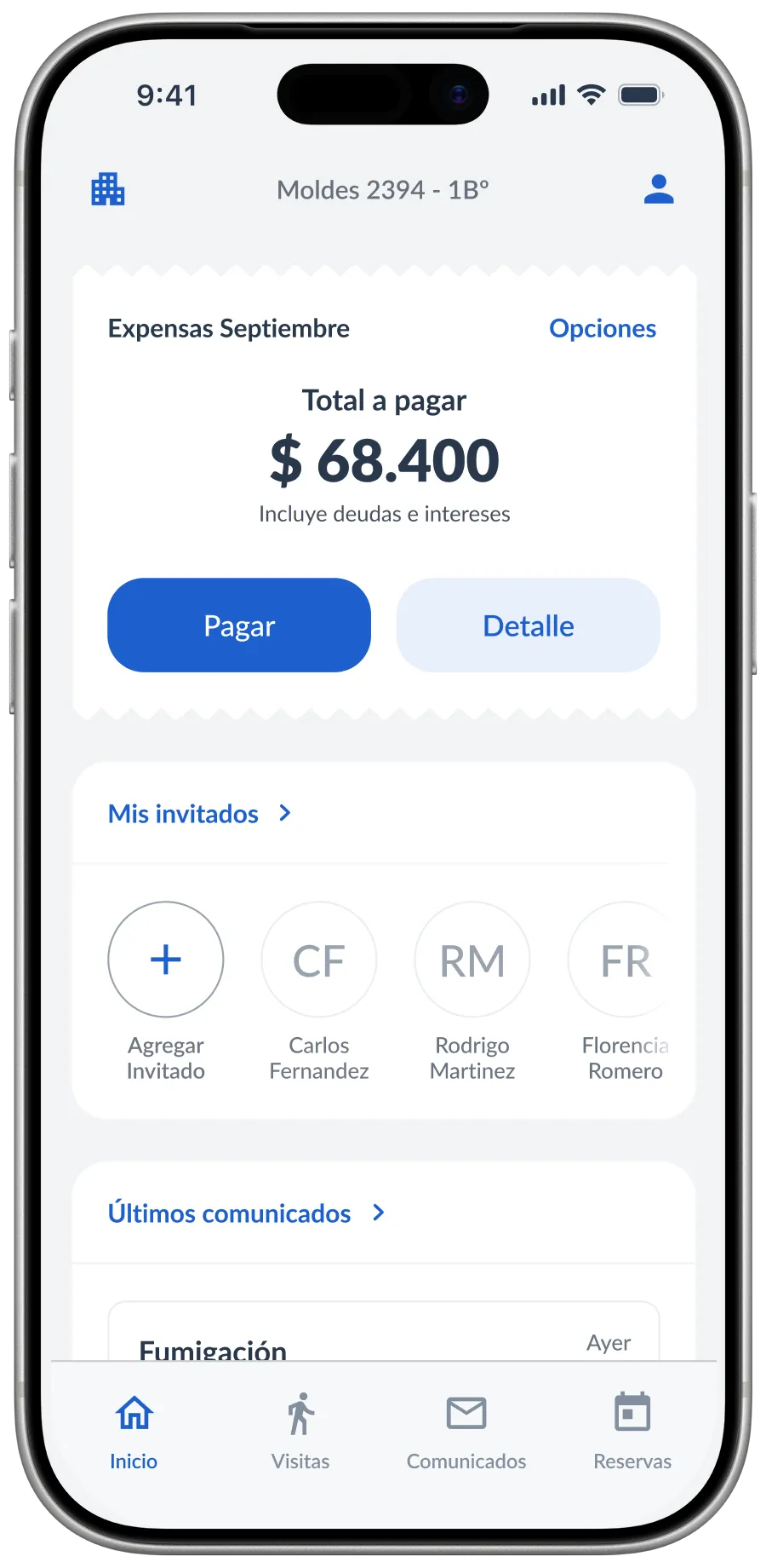
The app brought announcements, claims, votes and building expenses together in one place. We designed the experience around clarity and access to information, with a simpler, friendlier visual language than the administrator’s management tool.
To present the building expenses we used the shape of a ticket, so the amount would feel familiar and easy to recognize. The pay action had the highest priority, with direct access to the payment gateway and an option to see the breakdown.
Below, the modules adapted to the type of property. Gated communities showed visitor management; buildings, amenity bookings. That organization let us prioritize the features relevant to each context within a shared structure.
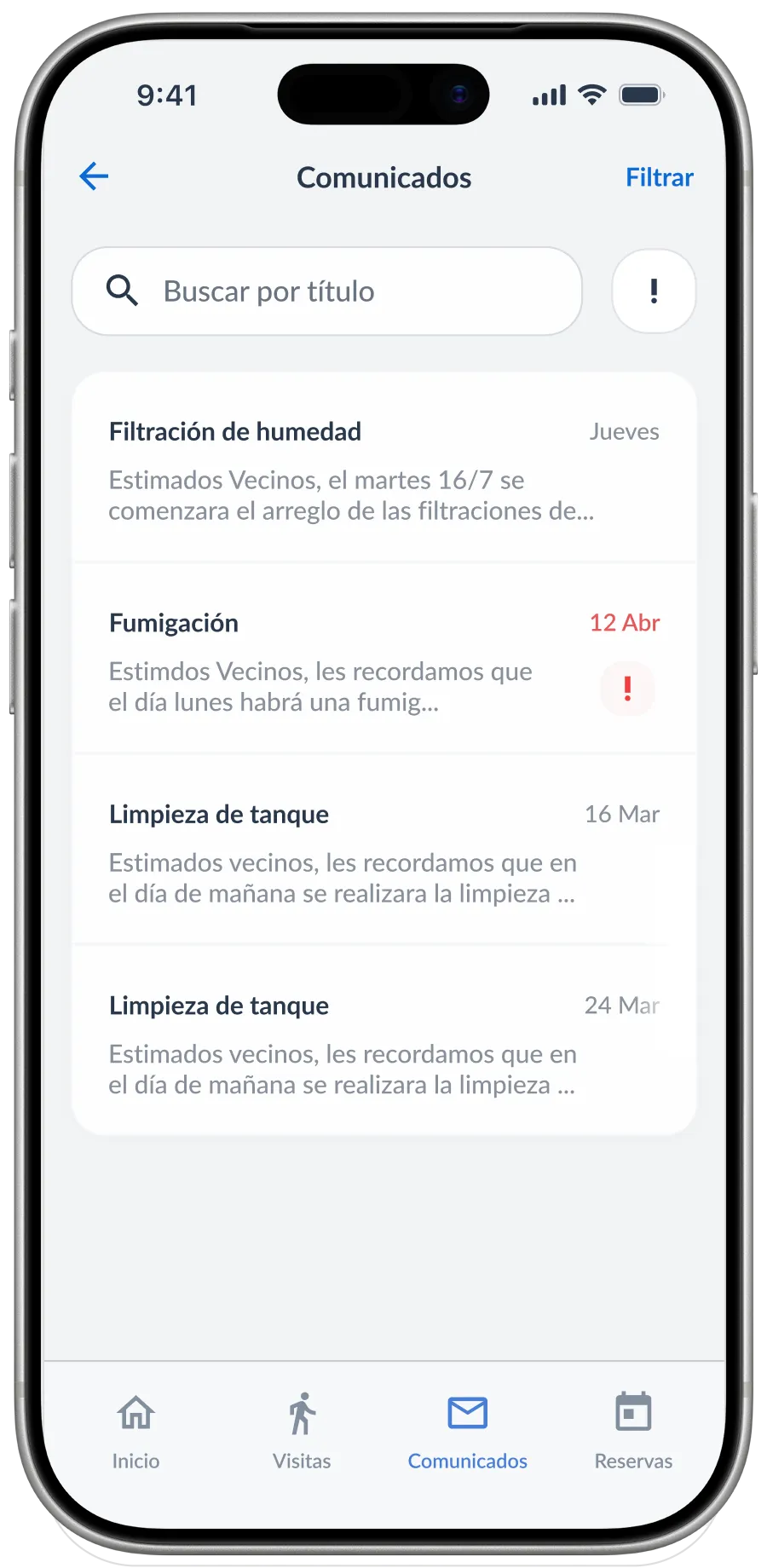
The announcements view was the counterpart to the administrator’s publishing tool. We prioritized readability and essential information, highlighting important notices such as maintenance or fumigation.
Search and filters let residents go back through the history to find an announcement. They could check the building’s information in one defined place, without having to piece it together from emails and messages.
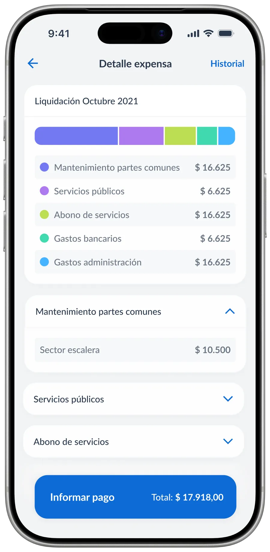
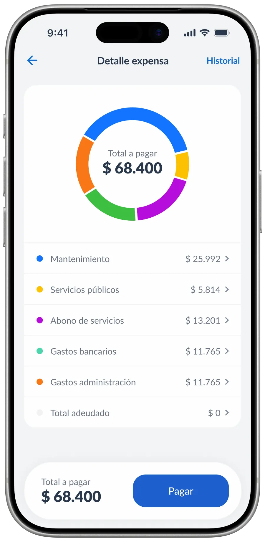
One of the most important issues in the feedback was how hard it was to understand what made up the total to pay. The first version used a horizontal chart and technical lists that felt overwhelming.
Through iterative testing, we moved to a donut chart with the total in the center and a more compact list of categories. The new hierarchy showed the split between maintenance, services and other expenses first, before going into the numbers. The amount and the pay action stayed available at the bottom.
The intent was for residents to understand what they were paying and check its breakdown within the same experience.
The project extended the desktop redesign into a mobile experience for administrators and an app for residents. Communication gained owners and history to follow up on cases, and residents could keep notices, claims and expenses together within the platform.
The resident app reached a 4.7 rating on the App Store with more than 1,600 reviews, passed 100,000 downloads on Android and made the Top 20 productivity apps for iPhone in Argentina.
Interviews throughout the project and iterations on the expense breakdown let us adjust decisions as we went. The main lesson was working together with different areas: the client, the technical team, support, development and sales. Every design decision lived alongside other considerations, such as the technical migration, the backlog, adapting the product for Colombia and a small rebrand.